In a TED ED talk on the beauty of data visualization marketer David McCandless spoke of the overload of data in today’s world and how visuals create a way of communicating a lot of data in an effective way. McCandless explained in his talk that the art of doing this can be described as combining “the language of the eye with the language of the mind,” and that data “comes alive through living imagery.”
I have experienced the power visuals have firsthand as a marketer for a small business. The real estate brokerage I work for has a large quantity of information that it seeks to communicate with potential agents, customers and the community at large. I have always sought to use graphic design and eye-catching imagery to express important messages the company wishes to convey when I put out content. I have found that it is important to do this in all areas messages are communicated: from printed materials to email marketing to social media.
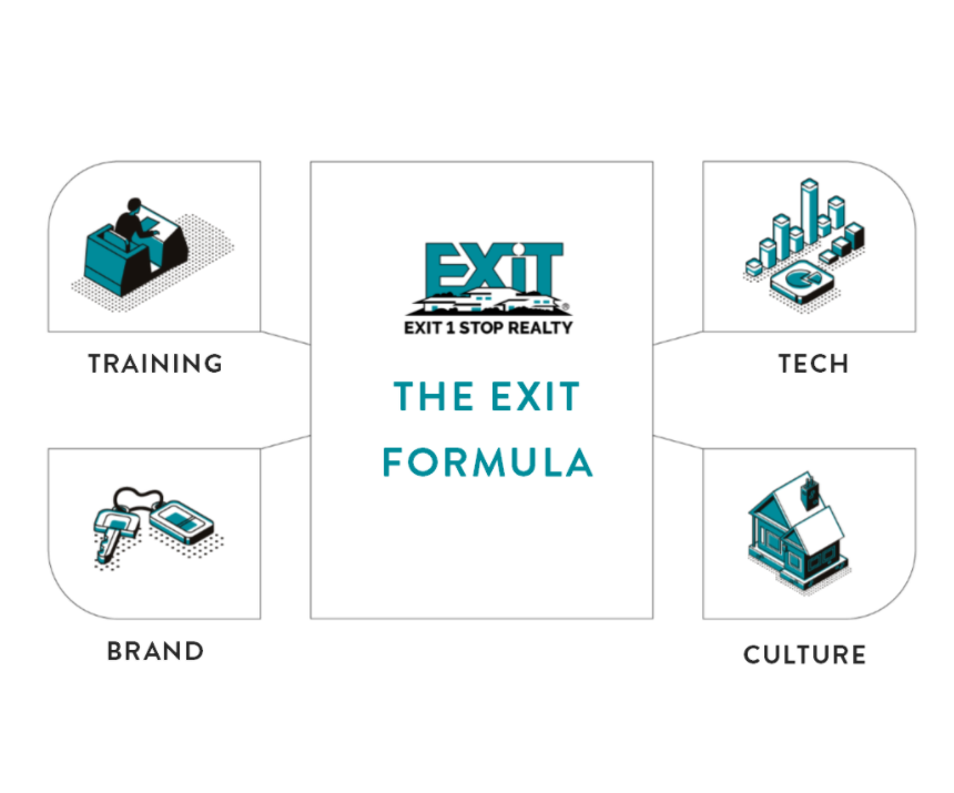
One of our company goals is to recruit new agents to the brokerage. There are several things that we offer that set us apart from other companies. Our campaign to express this is advanced by the graphics we had custom designed for these purposes. For example, we designed our “4 pillars of EXIT” into a branded infographic which we use on our recruiting landing page, social media posts and in our printed materials. Last year in an effort to further capture attention visually, I decided to take the use of these visuals a step further by having our brand icons transformed into gifs. These gifs express information but also grab the attention of the audience in a way that is easy for them to consume.
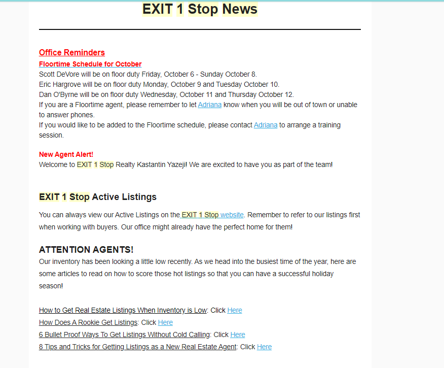
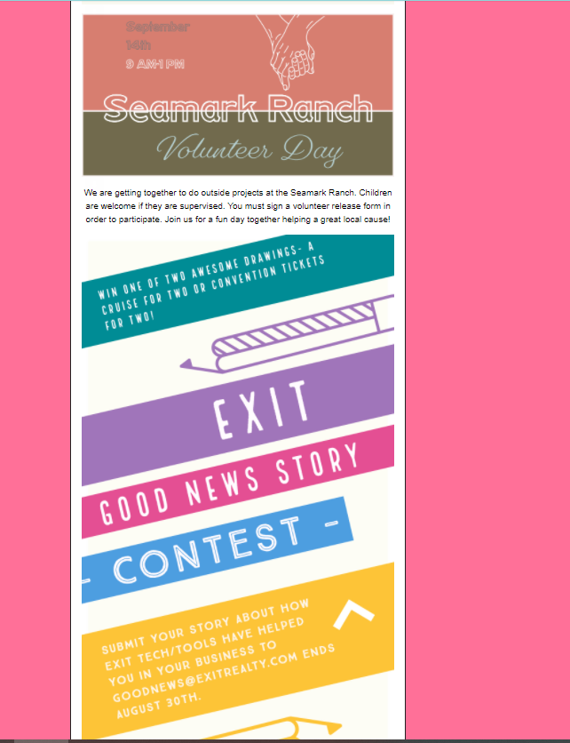
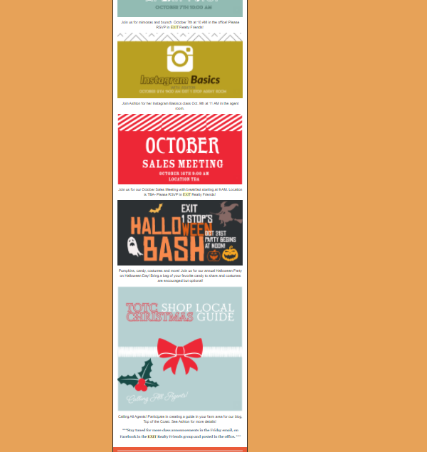
Another example of how I do this successfully is in our internal company communications. One of my duties as marketing coordinator is to send out a weekly email to our company and agents with important information and news. The company was having trouble getting its agents, who are independent contractors, to read the email when I first took over the task. In the past they had tried to get people to pay more attention to these weekly newsletters by adding a trivia question at the end of the email with those who answered correctly getting a chance to win a prize.
After I took over I realized that if I changed the design of the email to make it more visually appealing that perhaps more people would read it. The email had a lot of information but no graphics or pictures.
I completely redesigned the email, putting all the important information into creative and visually stimulating graphics. I even added themes and changed the colors and fonts of the email weekly. This completely solved the problem of readership of the company email without the need for prizes or trivia questions. The visual design itself attracts people to open it and encourages them to absorb the information.