
As the marketing coordinator at Florida real estate brokerage EXIT 1 Stop Realty, I have overseen a major overhaul of the digital marketing program at the company. In the past three years our digital marketing has expanded into a new recruiting landing page, new email marketing campaigns, new and enhanced social media and an entire brand redesign. We have also continued to streamline the components of our digital marketing across multiple platforms which has established a more consistent customer journey.
One of our main goals as a company is to recruit new real estate agents to our brokerage and we have built up a solid digital marketing campaign aimed at meeting this goal. In early 2020, we launched a new recruiting landing page. There are several elements of our recruiting landing page www.joinexit1.com that keep our target audience, potential agent recruits, on a smooth customer journey which I will critique below.
Verbal Cues
Headline: The headline “it’s time to Exit,” is a play on our company name and sums up our main advertising statement to potential agent recruits.
Value Proposition: The value proposition at the top of the page recalls our main selling point as a brokerage. This is that we offer something unique in the market to real estate agents: our culture, and residual income with the EXIT formula. The prompt states, “There’s some pretty great reasons to leave the typical brokerage life and go with something different – something better.”
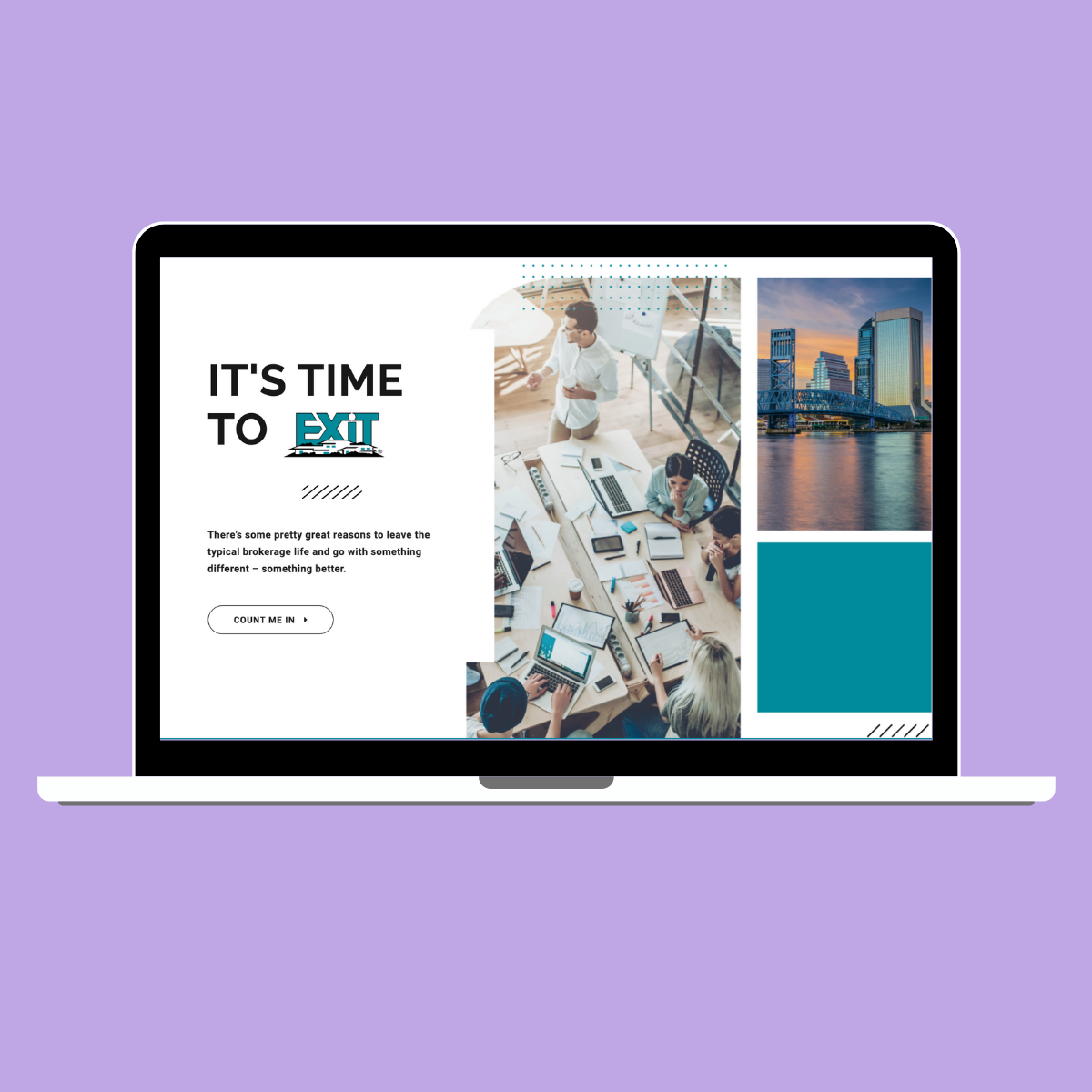
CTA: If a visitor clicks the button that says count me in it takes them to a lead form at the bottom of the landing page that prompts the visitor to get in touch with us. This form goes to our recruiting team, and they follow up with an email.
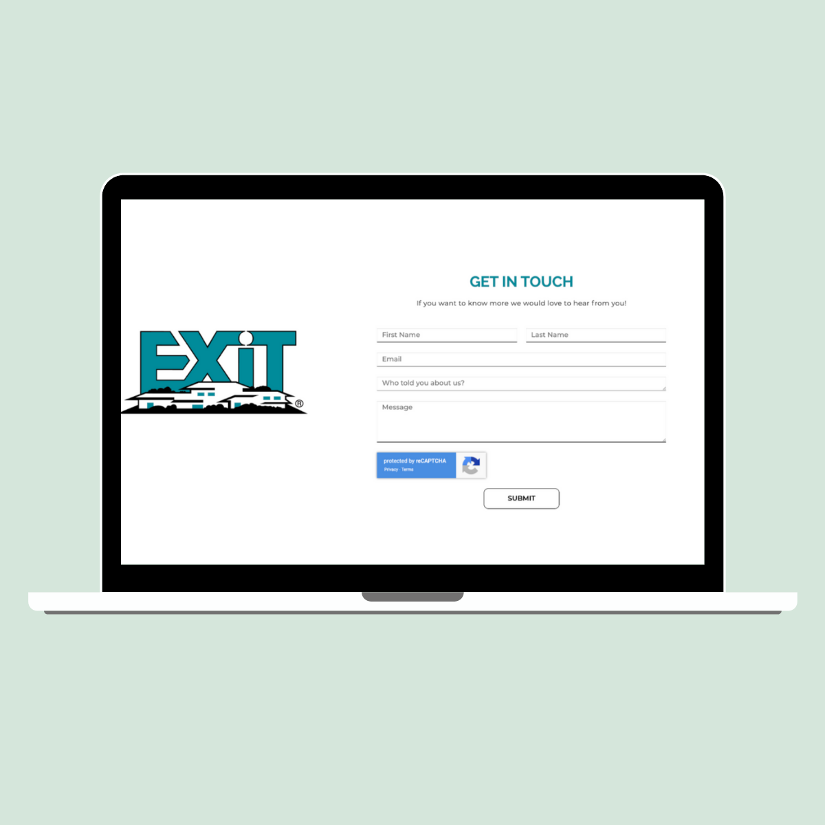
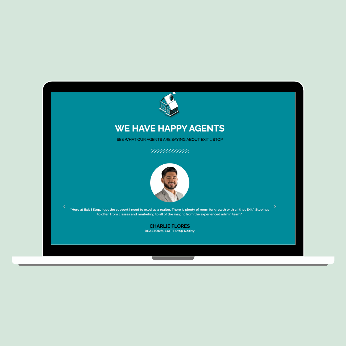
Ratings and Reviews: We included some excellent reviews from our current agents to provide credibility to the statements on our page. These glowing reviews are displayed on a scrolling carousel at the bottom of the page.
Visual Cues
Brand Elements: Our company underwent a complete brand redesign in late 2019. The brand design includes the core elements of the EXIT Realty brand, which is the signature teal color and logo along with new elements that are unique to our brokerage.
Hero image: The hero image on our landing page was another element we had designed during our brand redesign. This image is also on the cover of our printed booklets we give as takeaways during our agent interviews at our office. The stock photos, color filters, and additional icons were all carefully chosen and designed by our team.

Additional Images, Pop Ups and Brand Design: There are several unique elements for our brand that were part of the new brand design package. They include branded gifs, which are used throughout the landing page. The stock photos such as the teal door, office photos and Jacksonville area images are also used throughout the page. Lastly, icons such as dashes and dots in our brand colors are used which reflect the playful whimsy of our brand. I worked with the designer on all these elements, with the intention to keep the above stated look and feel of our brand consistently present.


Here is a brief overview of how we keep the customer journey discussed above consistent across our other digital platforms.
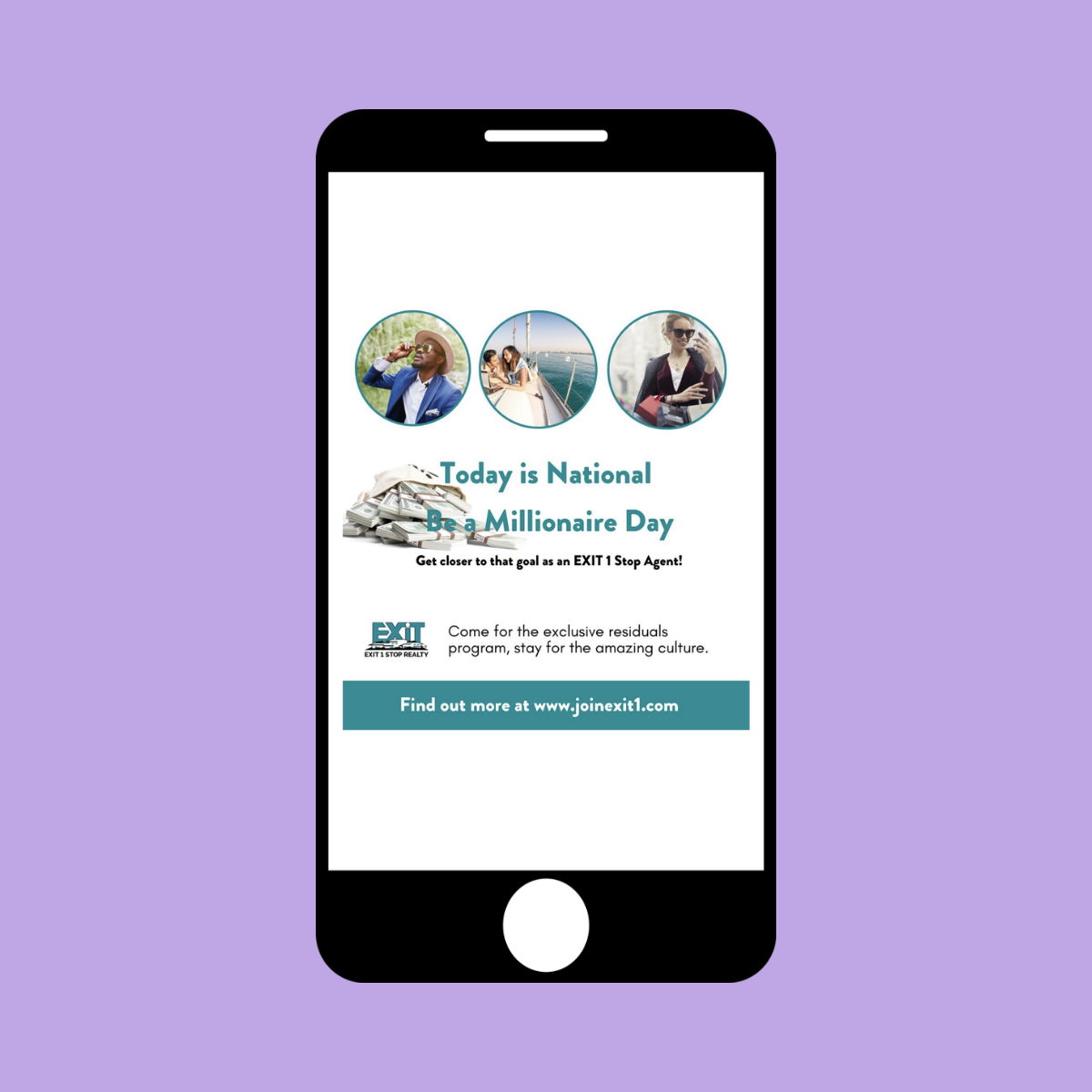
We keep the message to our target recruiting audience focused on the most unique things our company has to offer which is our culture and the EXIT formula. We also keep the landing page www.joinexit1.com top of mind in our digital marketing. The visual elements such as our branded gifs and icons are also consistent across all platforms. Our brand personality which is whimsical, fun and family friendly is also consistently reflected across all our digital marketing platforms. Some key highlights are discussed further below.
Social Media:
Most of our social media efforts are focused on the platforms which are most popular for the real estate industry which has continued to be Instagram and Facebook. Although we have investigated expanding our efforts onto some new popular platforms for the industry which are emerging such as LinkedIn and Tik Tok. We have kept a consistent presence on Instagram and Facebook, posting daily for years. Our brokerage has three different target audiences we are attempting to reach: real estate customers, the general Northeast Florida public and potential agent recruits. We build in posts weekly for each target audience and our recruiting audience maintains the visual and verbal consistency from our recruiting landing page.
Email Marketing:
We keep the verbiage in the call to action of our emails consistent with our landing page. The subject line repeats the phrase, ““There’s some pretty great reasons to leave the typical brokerage life and go with something different – something better.” We also embed the link to our landing page at the top of the emails. We also include the same visual cues such as our branded gifs, images, fonts, and colors in our emails.
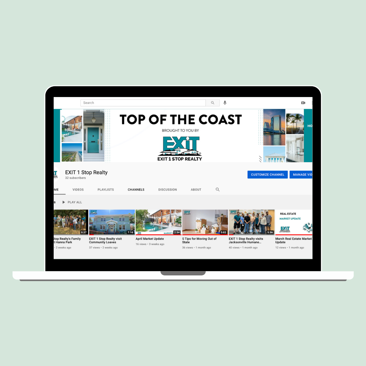
YouTube:
The visual design of our YouTube channel and video content incorporates our brand images and brand personality as well. The content we choose to cover in our videos is also carefully chosen based on research and a deeper consideration of what would best give valuable information desired by our target audience and reflect our brand personality.
In today’s digital world it is important for brands to keep the customer journey as smooth as possible in the visual and verbal cues they give in their digital marketing efforts across all their media channels. I have found that it is easy to do this if you have developed your brand, established your target audience, and clearly defined your marketing goals.
